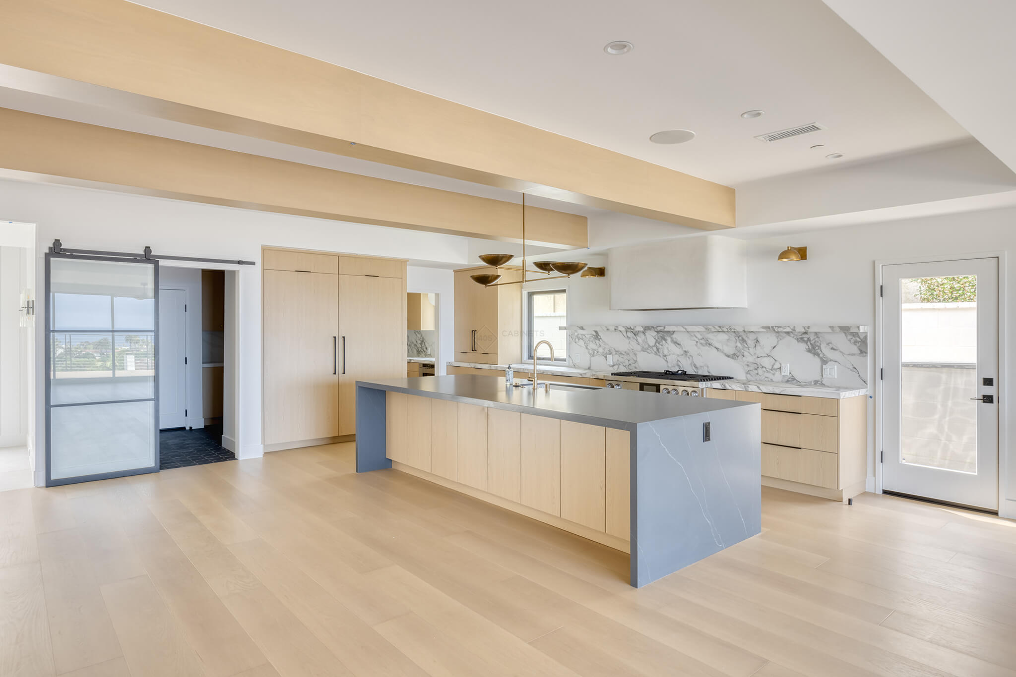

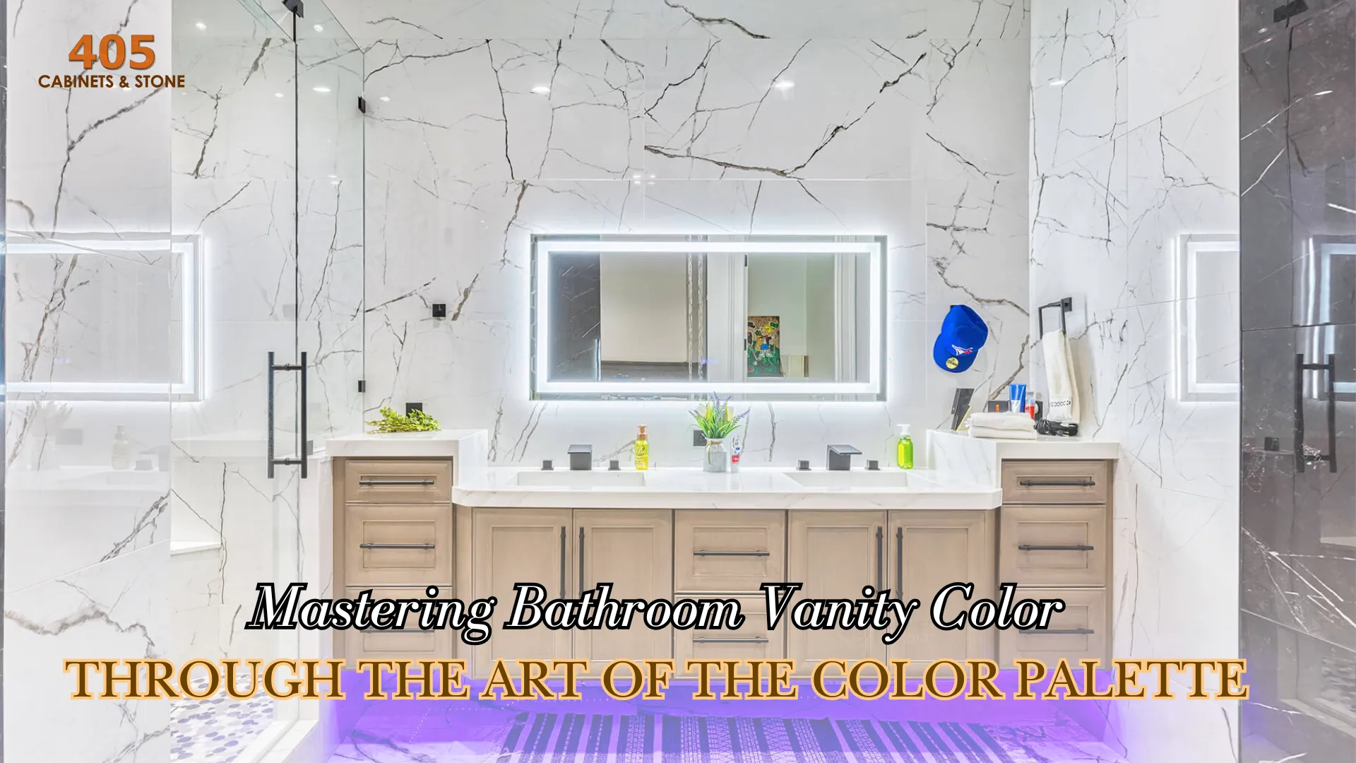

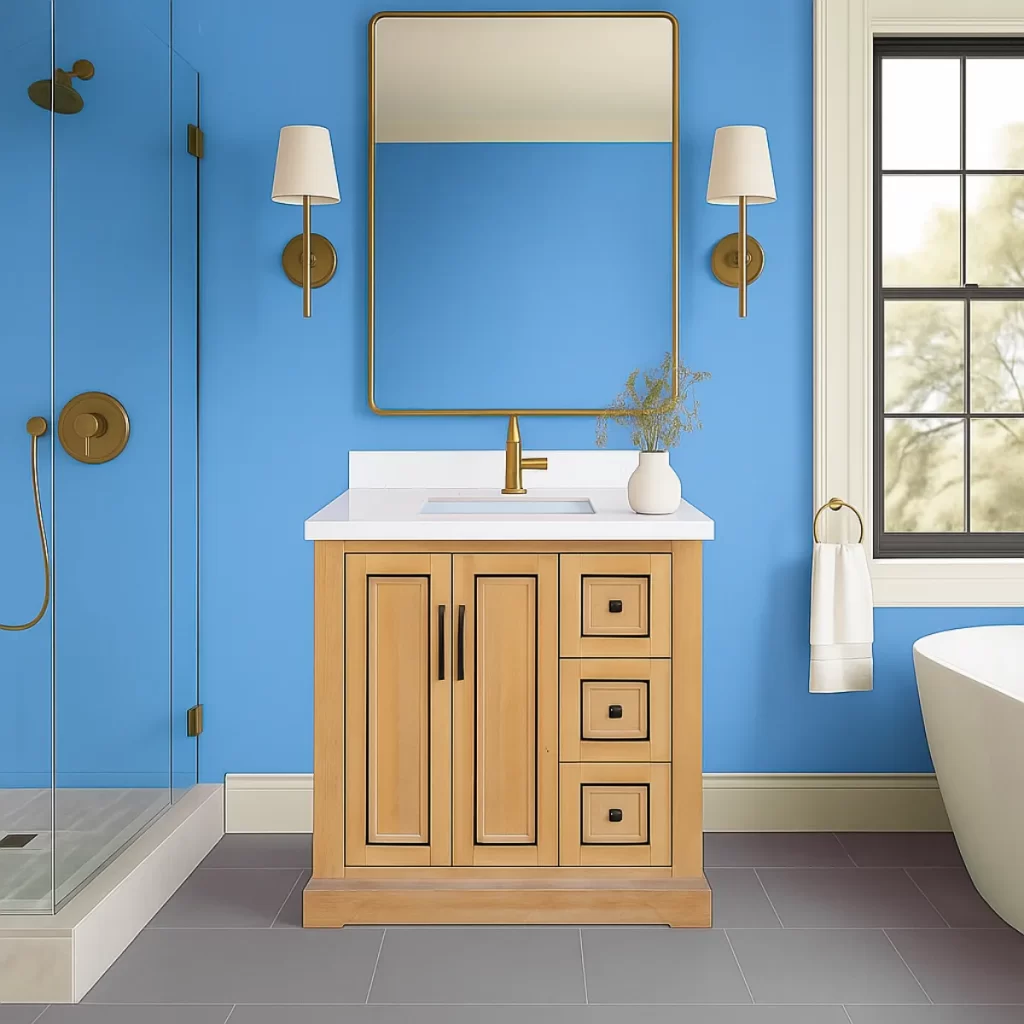
Why the Right Vanity Color Matters
The vanity is the centerpiece of your bathroom. It is the anchor of the room, shaping how every other surface and finish is perceived. The right vanity color can elevate the space into a calm retreat or make a bold statement, while a poorly chosen one can throw off balance and create chaos instead of harmony. Because bathrooms combine light, texture, and reflective materials, color behaves differently in that space than in any other room. Understanding how to use the color palette thoughtfully allows you to make more confident assessments and provide you with the right insight into how to choose your bathroom vanity color.
Understanding Color-Scheme Methods for Interiors
Every designer relies on color theory to create spaces that feel intentional. A color wheel reveals how the various hues relate to one another and provides frameworks known as color schemes. These include monochromatic, analogous, complementary, triadic, and tetradic arrangements. Each has its own mood and level of contrast, and each can guide you toward a vanity color that ties your bathroom together and makes it fluid rather than creating competing moods that defeat the purpose.
The Monochromatic Scheme
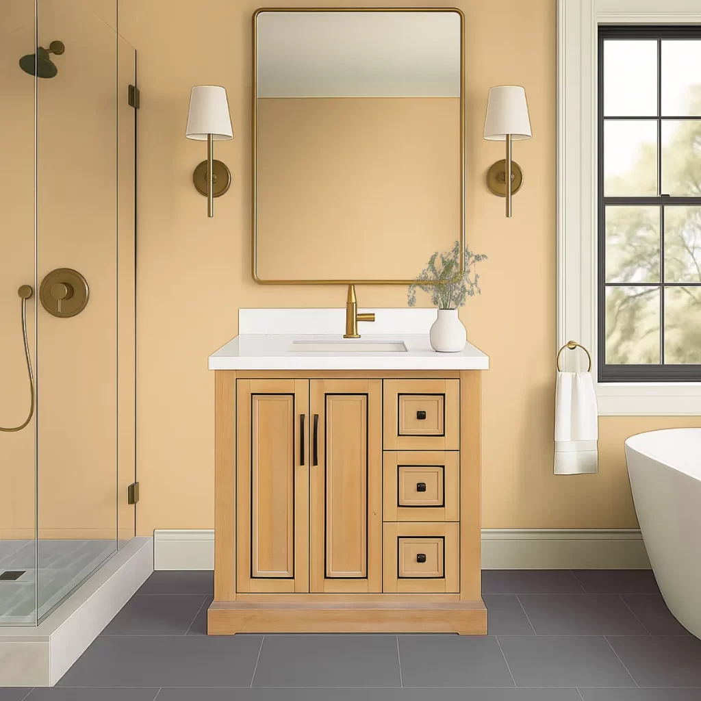
Knowing how to coordinate monochromatic tones can help you choose a bathroom vanity color that ties the whole design together.
A monochromatic scheme revolves around a single hue explored through its tints and shades. It creates serenity and visual continuity, making it especially suitable for smaller bathrooms. Imagine a wall in light yellow paired with a vanity in a slightly deeper tone of the same family, such as Chateau. The effect is soothing and consistent, allowing light and texture to take center stage. The only important notice with this method is to add variation through finish, grain, or subtle texture so the room feels rich rather than flat.
The Analogous Scheme
Analogous colors sit side by side on the wheel, such as teal, blue and violet. They share undertones and create a sense of flow. The relationship between these hues feels effortless and tranquil. To keep harmony, select one hue to dominate, another to support, and a third to accent so that the space feels layered but not chaotic. A gentle reminder is to check undertones carefully because mixing warm and cool versions of neighboring hues can disturb the balance.
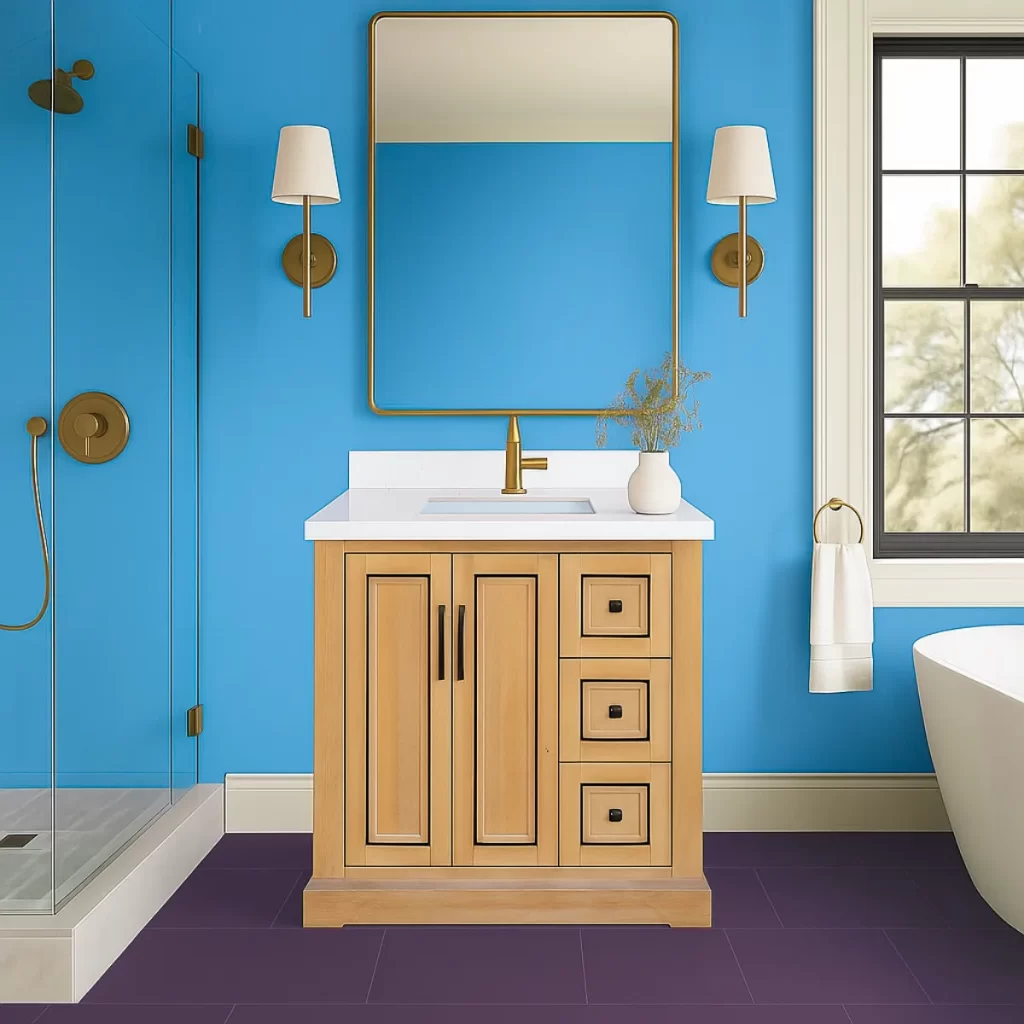
The Complementary Scheme
Understanding how to create contrast helps you choose a bathroom vanity color that stands out beautifully.
Complementary colors sit opposite each other on the wheel and deliver vibrant contrast. Think of a natural oak vanity against a muted teal wall or a dark Navo vanity paired with warm peach accents. This approach instantly creates a focal point because the eye is drawn to opposites. In small bathrooms, such intensity may feel overwhelming if not moderated with neutral elements such as white fixtures or natural stone surfaces. The goal is contrast with refinement rather than clash.
The Triadic Scheme
The triadic approach uses three hues evenly spaced on the wheel. It introduces liveliness and balance while maintaining order. The key is proportion. Let one color dominate, another support, and the third appear sparingly as an accent, keeping the space elegant. Because triadic schemes carry more variety, restraint in finish, and the avoidance of repetition of the accent tones helps prevent visual overload.
The Tetradic Scheme
Tetradic arrangements combine four hues, typically two complementary pairs. They offer rich complexity when balanced correctly. Picture walls in soft sage, a navy vanity, muted gold hardware, accents of gentle terracotta in towels or art, and an Eden Spice vanity coupled with matte black hardware. This palette feels layered and contemporary yet requires discipline. One hue should lead while the others provide depth and rhythm. Adjusting lightness and saturation ensures that no color feels out of place or too dominant.
Applying Color Schemes to Bathroom Vanities
When theory meets reality, the practical details decide success. Always test your chosen vanity color under the bathroom’s actual lighting because both warm and cool lights can shift perception. Materials also influence how color reads. A finish in engineered quartz or sintered stone may appear brighter than a painted or stained surface. Consider the undertones of your countertop and floor, as this will influence how your vanity color interacts with them.
Final Thoughts
Colors in a bathroom never exist in isolation. Lighting, finish, and surface reflection all change how they appear throughout the day. Sampling is essential to ensure your chosen shade feels right under real conditions. While trend colors can be inspiring, timeless appeal comes from choosing hues you genuinely enjoy living with rather than following seasonal fashion. The bathroom should bring calm, balance, as well as a feel that aligns with your personal taste. Let the experts at 405 Cabinets & Stone guide you through the process and bring your dream bathroom to life!