

Color carries the power to shape the entire feeling of a kitchen, not only creating the aesthetic dynamics but also its defined structure. While the right palette can make the space feel warm, open and beautifully cohesive, the wrong one can make even the best layouts feel flat or unsettled. However, choosing the right color combination is not an easy task. Many homeowners feel overwhelmed when facing endless swatches, worried if they opt for something trendy today it might become tiresome tomorrow. A thoughtful approach to kitchen design colors can bring clarity and confidence to the process, turning the kitchen into a place that feels welcoming every day.
How Color Shapes the Kitchen Experience
A kitchen is not only a working space but also a place where people gather, talk and recharge. Color influences how spacious the room feels, how natural light behaves and how cabinetry and countertops interact visually. Lighter tones can brighten a smaller kitchen and reflect more light, allowing the room to feel calm and open. Yet deeper hues add richness and presence, especially in larger kitchens where color can anchor the layout.
Timeless Directions in Kitchen Design Colors
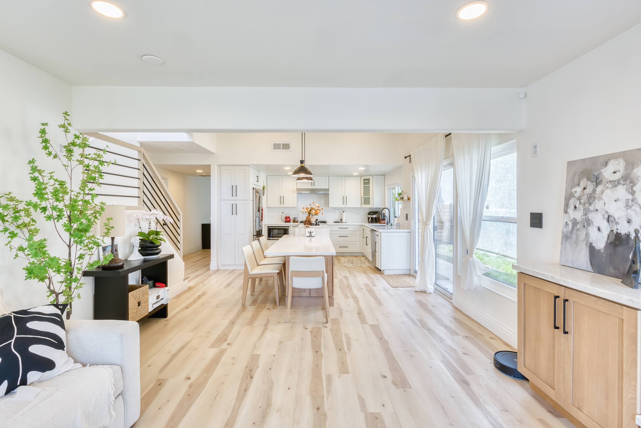
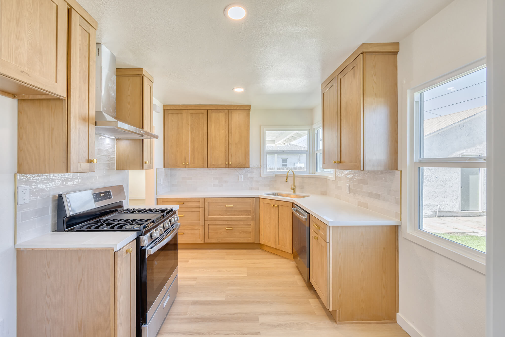
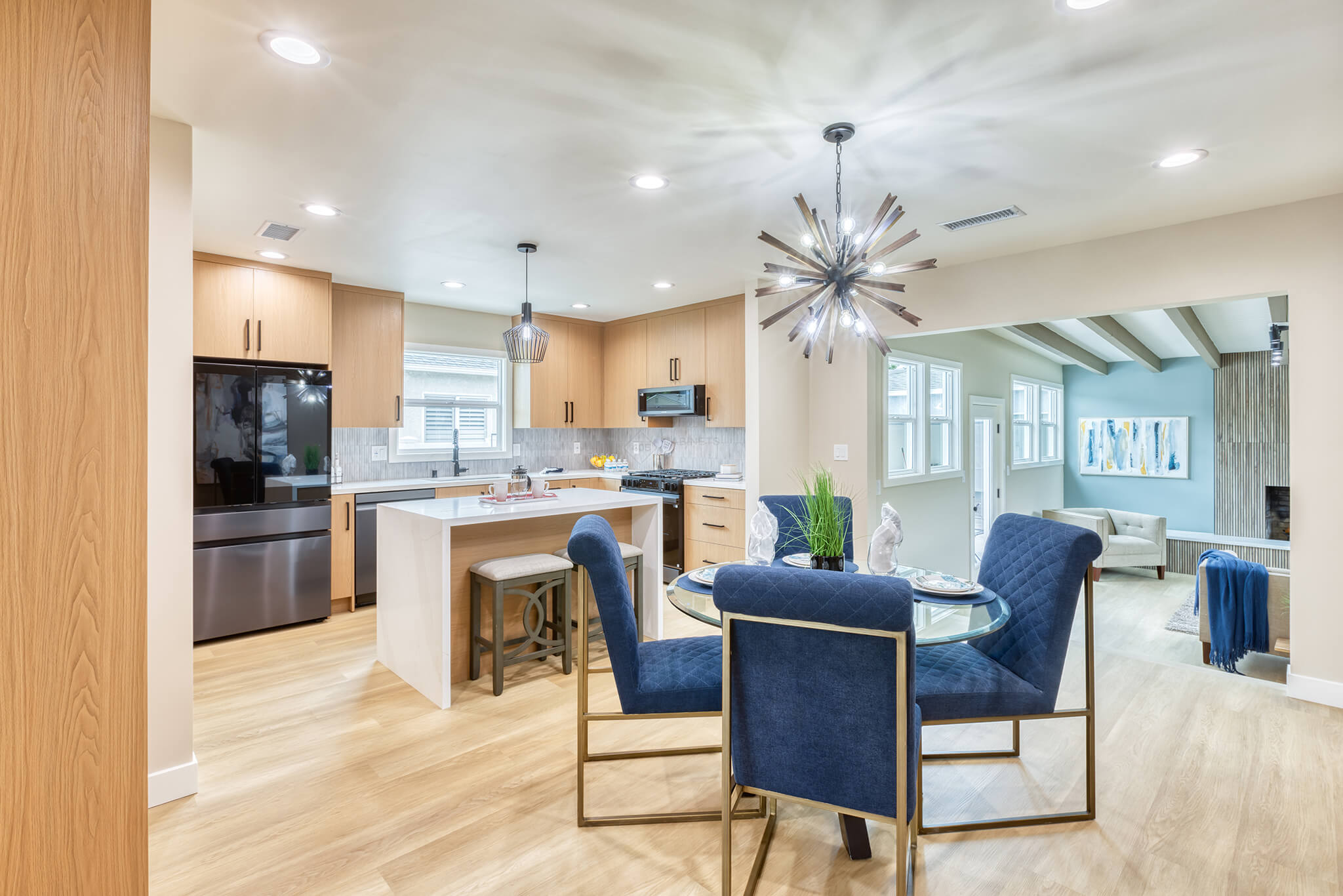
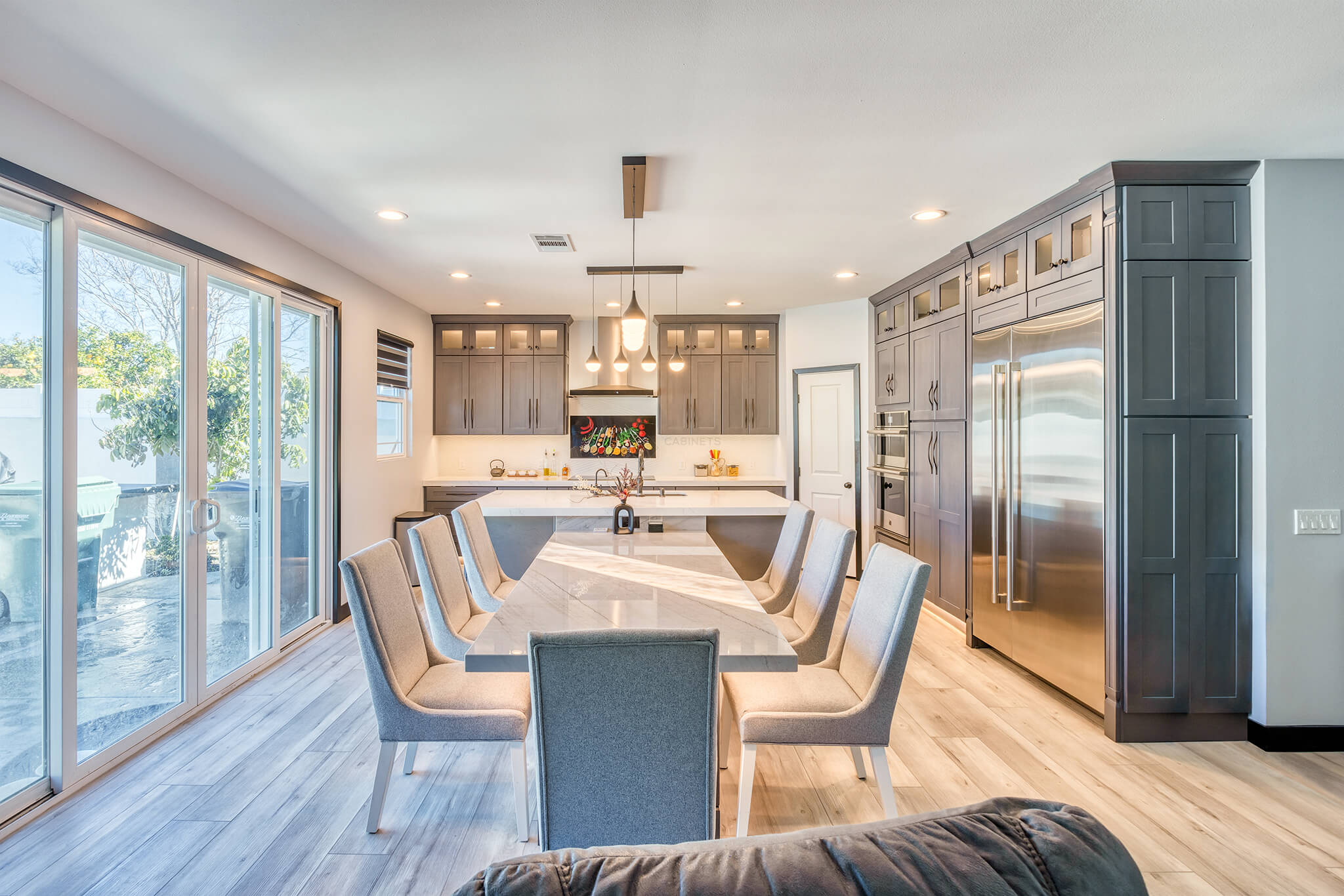
Across homes today, warm neutrals are creating inviting kitchens that feel lived-in without appearing busy. Soft off white, creamy tones and gentle light gray are favored for their versatility as well as the way they soften the edges of a room. Designers are also turning toward soothing shades of dark gray and deep blue for contrast. This is especially true for kitchen islands or accent cabinetry. These tones give character without making the space feel heavy.
Wood cabinetry such as white oak introduces natural character that pairs beautifully with subtle paint colors. These finishes welcome warmth into the kitchen, creating a balanced backdrop for nano crystallized glass, engineered quartz or even sintered stone countertops.
Choosing Colors That Work With Your Space
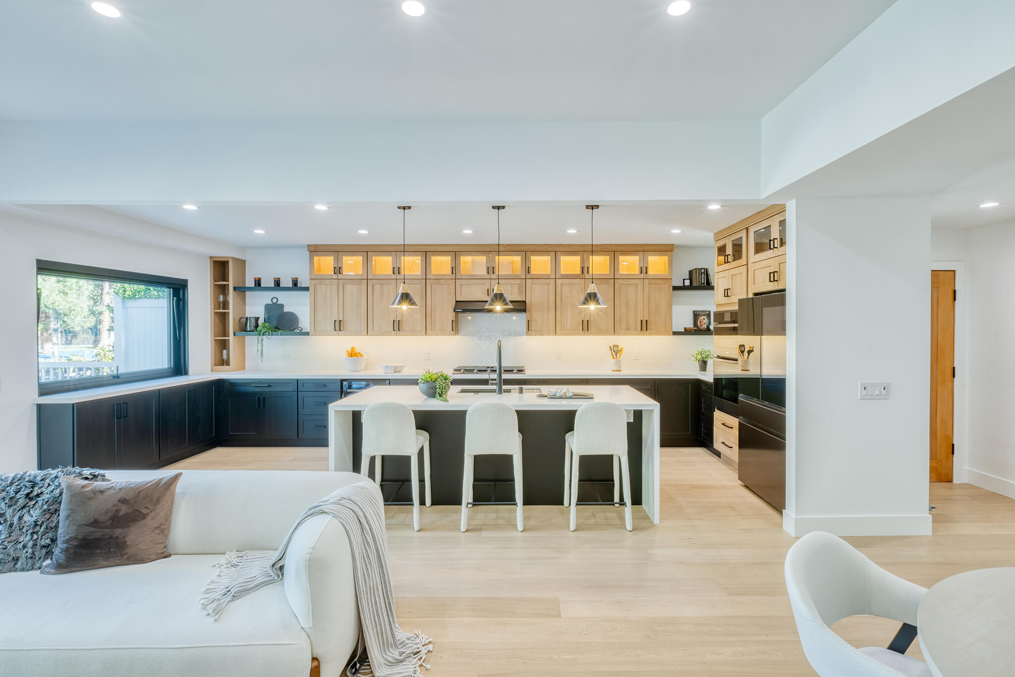
Every kitchen has its own personality shaped by layout, lighting and architectural features. In rooms with plentiful natural light, deeper colors can thrive and create a comforting sense of depth. The abundance of light helps make these colors more eye-catching. In kitchens with limited daylight, choosing soft neutrals keeps the space relaxed and airy.
Pay attention to how colors respond to artificial lighting as well. A tone that appears soft during the day may look sharper at night, while a deeper shade can appear darker than expected in shadowed corners. Testing colors in different lighting moments helps you avoid unexpected shifts once the paint dries and the room is lived in.
A Few Notices While Planning Your Kitchen Design Colors
Some colors can behave unpredictably in a kitchen design. Brilliant whites may feel too stark in a highly used room, especially if they are paired with other like-colors, making the space appear colder than intended. Highly saturated or extremely bright tones can also dominate the eye and compete with cabinetry, leading to a kitchen that feels restless or fatiguing. These hues are not off limits, but they require thoughtful balance so the space feels inviting rather than overwhelming.
Bringing the Palette Together
The most successful kitchen color palettes are the ones that feel natural to live with. Whether you prefer the calm presence of off white cabinetry, the modern edge of dark gray, the timeless comfort of white oak or the depth of a dark blue island, harmony is the goal. When colors complement your cabinetry, countertop material and lighting, your kitchen becomes not just stylish but genuinely comforting. Let the experts at 405 Cabinets & Stone show you our wide range of color options and help you design the kitchen of your dreams!