
A kitchen does not become memorable because one color is bright and another color is dark. It becomes memorable when every surface feels chosen with purpose. That is the real appeal of white and navy blue kitchen cabinets. The palette has confidence, but it still leaves room for warmth, comfort, and daily living.
Many homeowners are drawn to this look because it feels polished without feeling cold. The challenge is making the design feel intentional rather than copied from a photo. A successful kitchen needs proportion, rhythm, and quiet details that hold the whole room together.
White and Navy Blue Kitchen Cabinets Need More Than Pretty Contrast
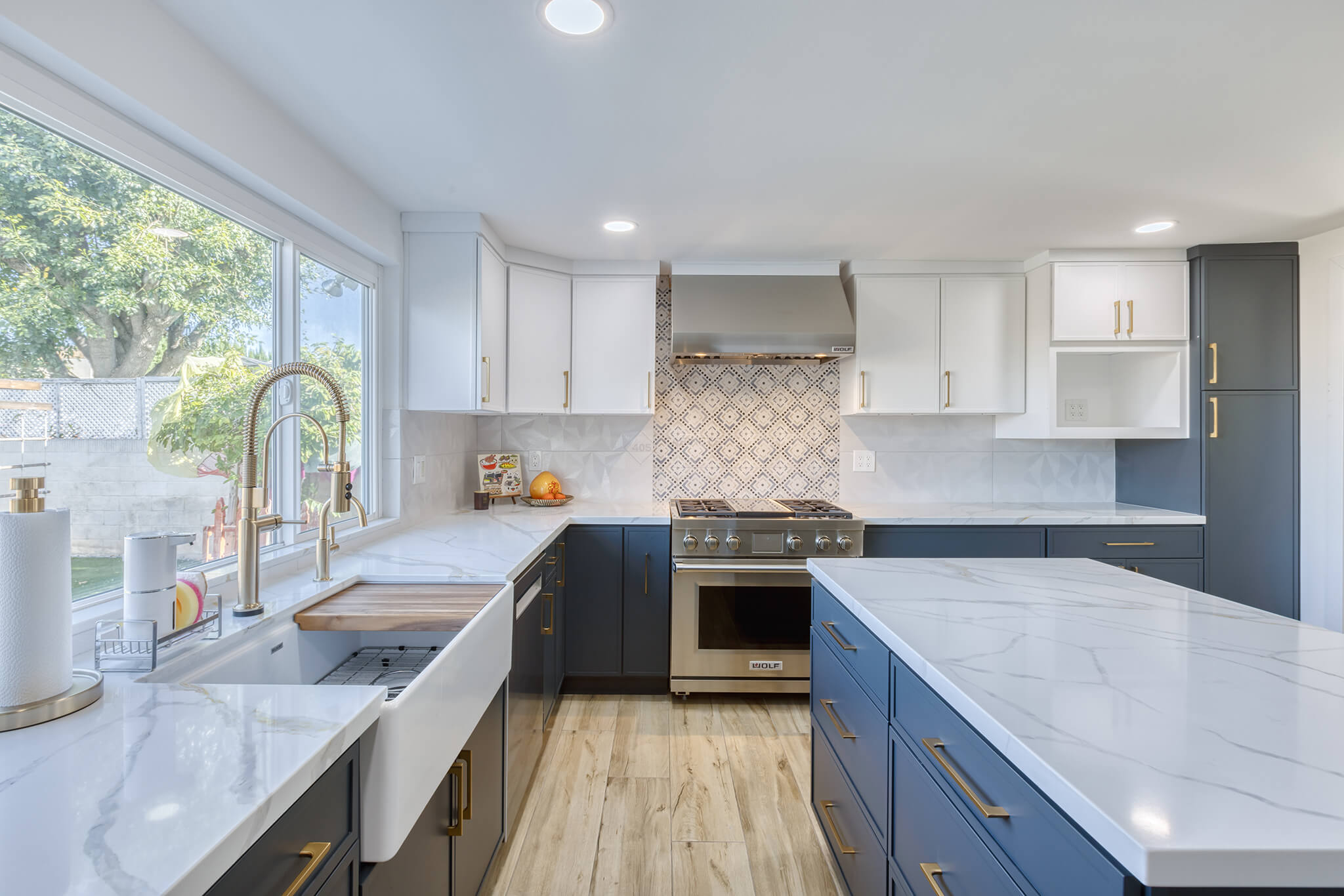
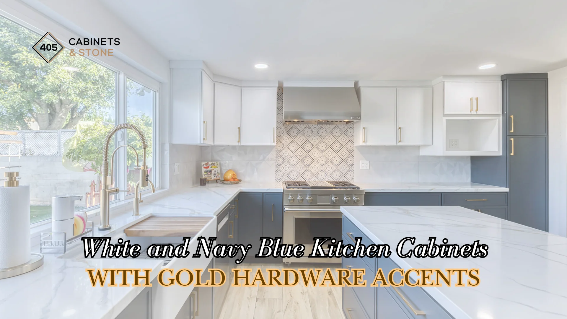
Julie’s Kitchen
The best version of this color pairing begins with visual order. Navy should not look like it was added only for drama, and white should not feel like empty background. Each color needs a job in the composition, whether it frames a cooking area, defines a storage wall, or gives the island a more furniture like presence.
This is where many remodels either feel refined or slightly unfinished. When cabinet color changes happen at natural stopping points, the kitchen feels planned. When the change happens without a clear reason, even beautiful cabinets can look busy. A good design lets the eye move through the room without confusion.
The Cabinet Door Style Decides How Modern the Palette Feels
Color gets most of the attention, but the door profile controls the mood. A slimmer shaker detail can make the palette feel clean and current, while still giving the room enough shape to avoid a flat appearance. This matters because navy has a strong presence, and the wrong amount of detail can make the cabinetry feel heavier than intended.
White cabinet doors also benefit from careful shadow lines. Small reveals, clean rails, and balanced panel proportions give the lighter finish more character. Instead of relying on color alone, the kitchen gains interest from craftsmanship and form.
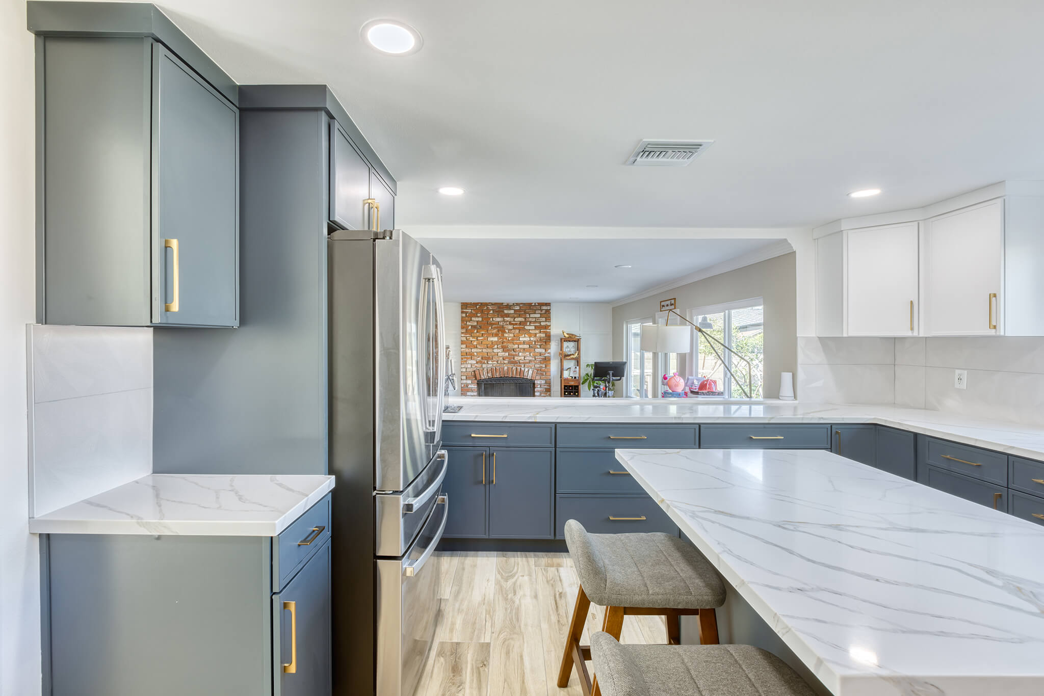
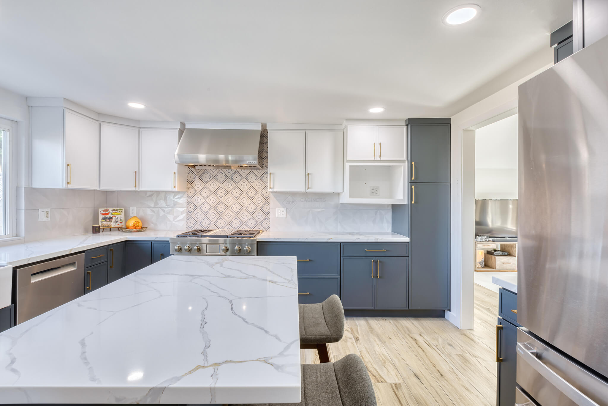
The Countertop Should Feel Calm Before It Feels Decorative
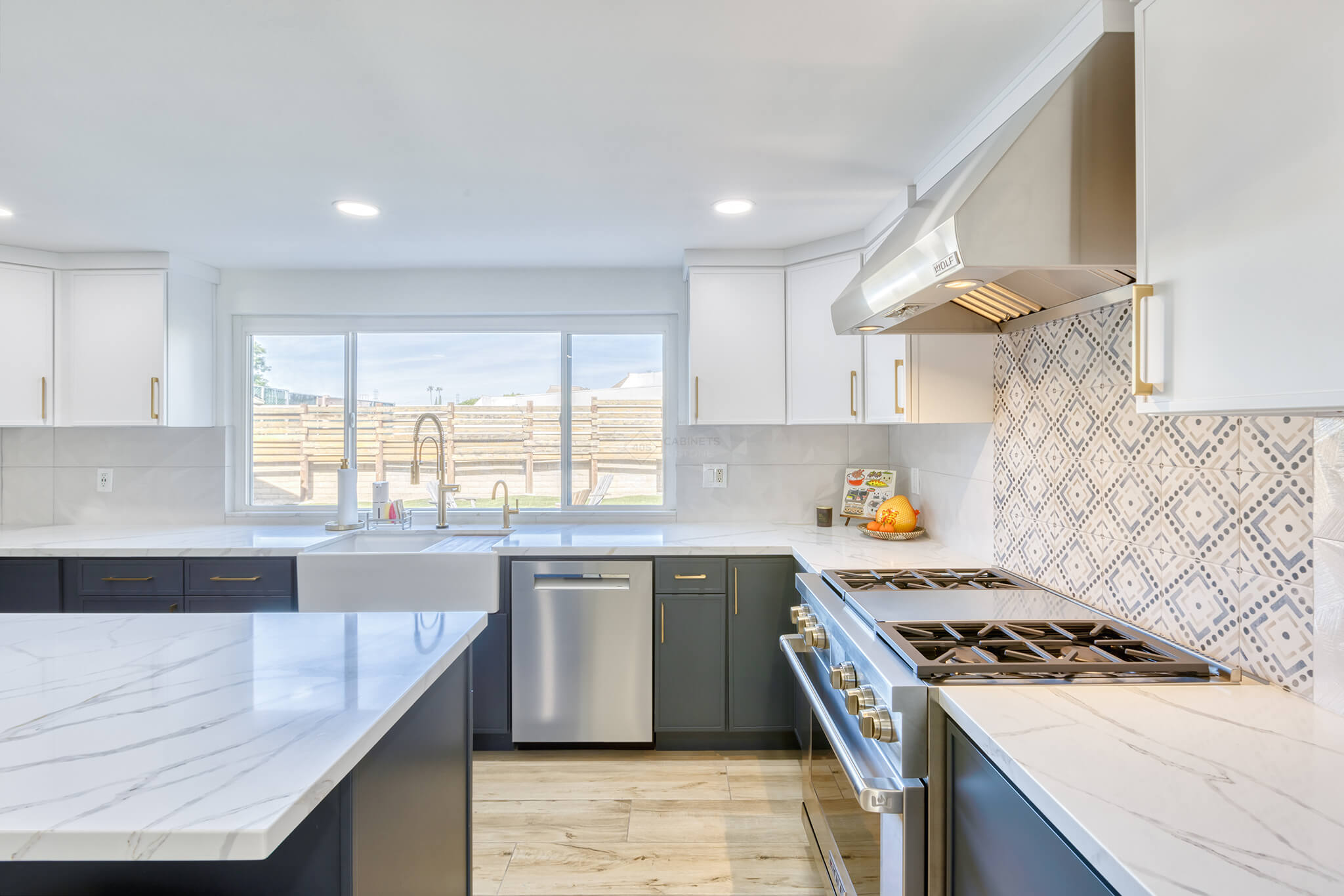
A countertop has to connect the cabinet colors without competing with them. Soft movement can be beautiful, especially when the pattern feels stretched and natural across a large island. If the surface is too loud, the room may start to feel like several design ideas are fighting for attention.
Engineered quartz, sintered stone, and nano crystalized glass can all support this kind of kitchen when the selected slab has the right scale for the layout. The important detail is not only the color of the surface, but how the veining travels near the sink, stove, and seating area.
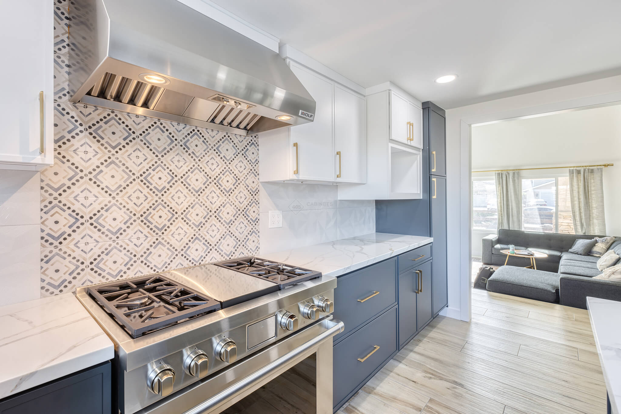
The Backsplash Can Create a Focal Moment Without Taking Over
A backsplash gives the kitchen a chance to show personality in a controlled area. In a white and navy kitchen, the best backsplash choice often supports the architecture instead of trying to become the main event. A patterned section behind the range can bring energy to the cooking zone while quieter surrounding tile keeps the room composed.
This approach works especially well for homeowners who want the kitchen to feel custom. The focal point feels intentional because it is placed where people naturally look, not scattered across every wall.
Hardware Gives the Palette Its Final Tone
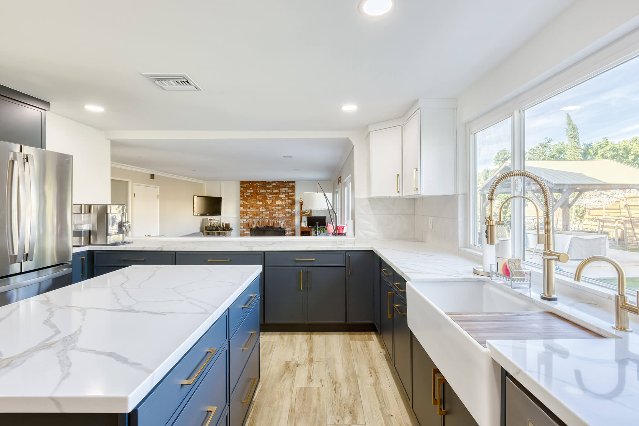
Hardware is small, but it changes how the colors are perceived. Warm metal pulls can soften navy and add a tailored finish to white cabinetry. Long handles feel sleek on wide drawers, while simpler pulls keep smaller doors from looking crowded.
The finish should repeat with discipline. When the same metal appears on the faucet, cabinet pulls, and nearby accents, the room feels connected. When too many finishes appear at once, the eye starts noticing the hardware instead of the design as a whole.
Lighting Changes the Way Navy Reads Throughout the Day
Navy can look crisp in morning light and more dramatic in the evening. That is why the lighting plan deserves attention before the remodel is finished. Large windows, recessed ceiling lights, and under cabinet lighting can help the deeper finish keep its richness without making the kitchen feel dim.
Good lighting also protects the white finish from looking flat. When light lands across cabinet faces, countertops, and tile at different angles, the room gains dimension. The palette feels alive because the surfaces are allowed to shift gently from day to night.
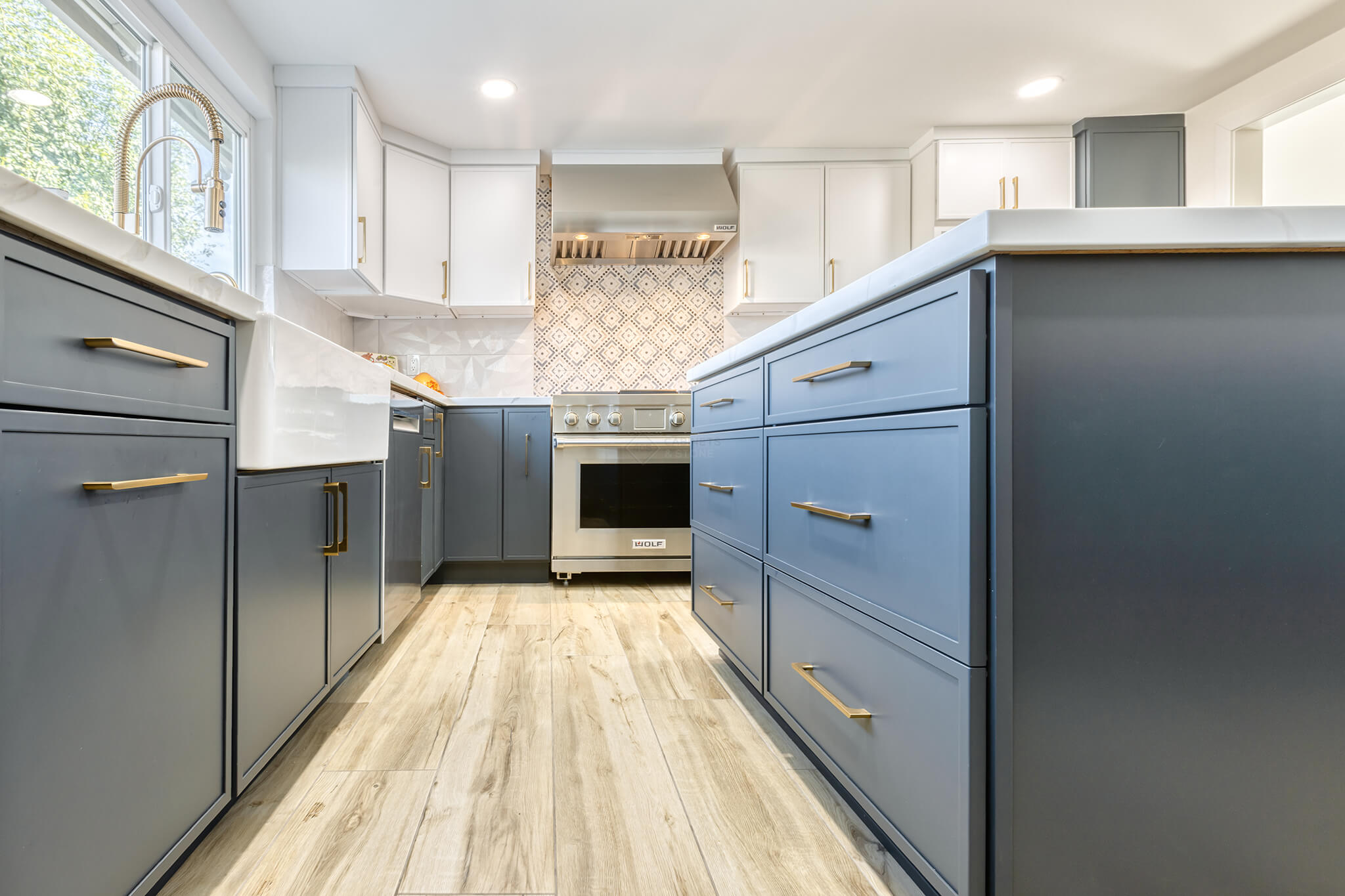
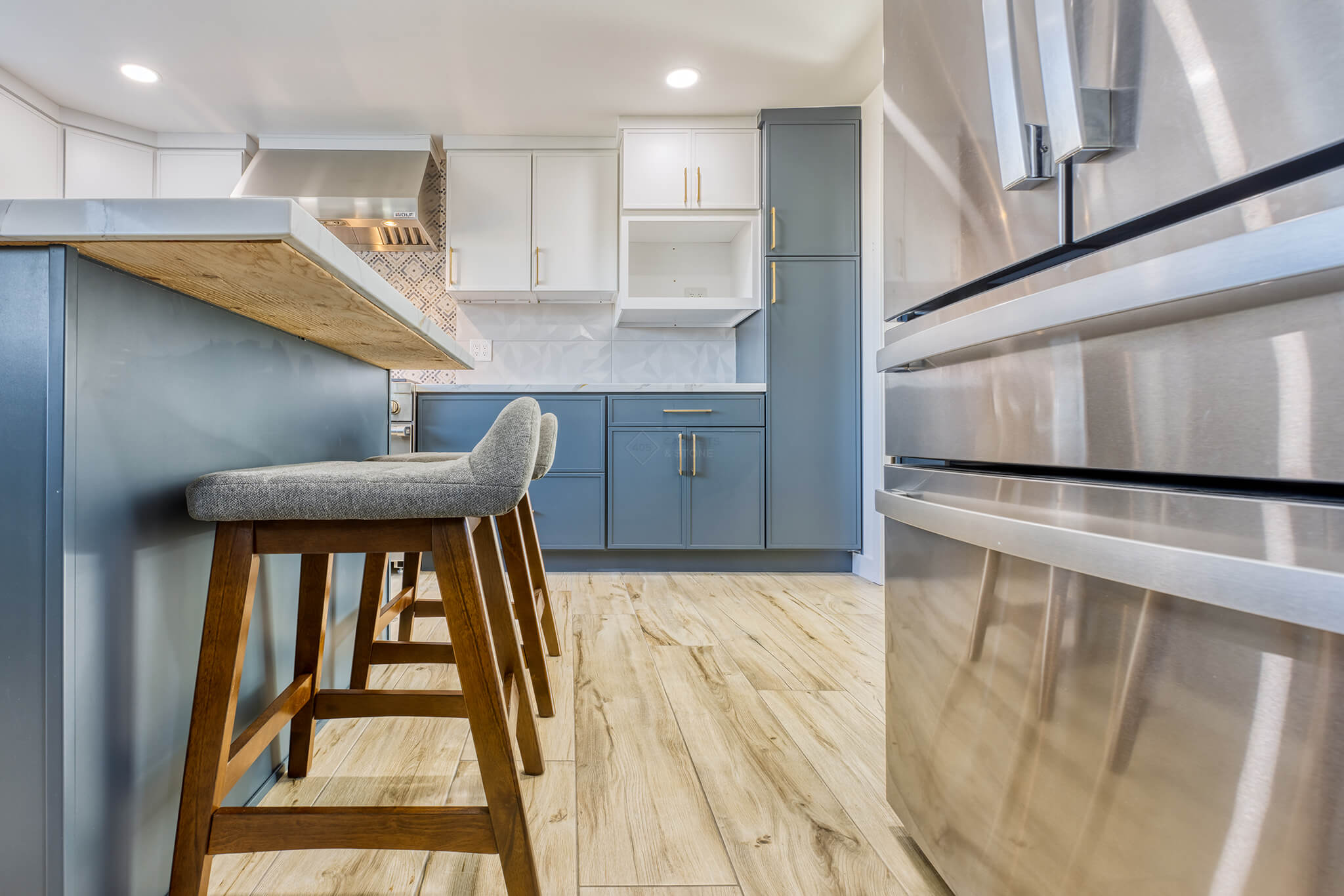
Julie’s Kitchen Shows How Real Details Carry the Design
Julie’s Kitchen is a strong example because the room does not depend on color alone. The wide window brings natural light into the sink area, the professional style range anchors the cooking wall, and the backsplash adds a crafted detail exactly where the kitchen needs a focal point.
The island surface also plays an important role. Its soft veining gives the room movement without making the design feel restless. Warm pulls add polish, while the flooring brings a natural tone that keeps the finished space approachable.
The Most Successful Look Feels Edited
White and navy blue kitchen cabinets already bring a strong design statement, so the surrounding choices should feel edited. A kitchen like this does not need every trendy detail. It needs confident spacing, thoughtful surfaces, and accents that know when to stay quiet.
That restraint is what makes the palette last. The kitchen feels personal, but not loud. It feels current, but not forced. Most importantly, it gives homeowners a room that looks finished from the first glance and still feels comfortable enough for everyday life.